

The Collaboration
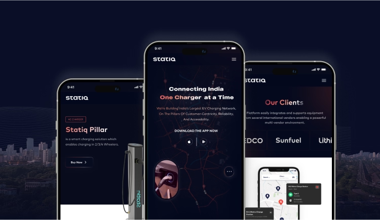
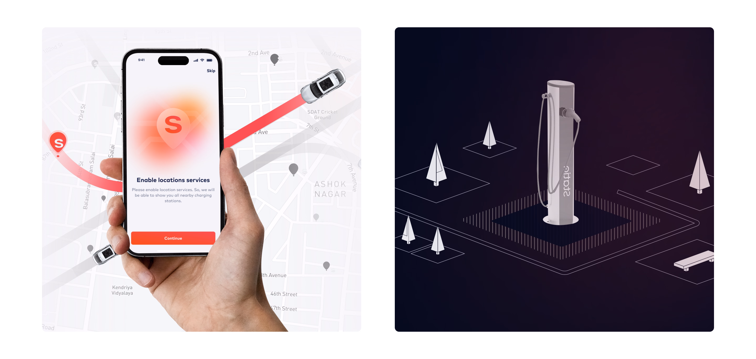
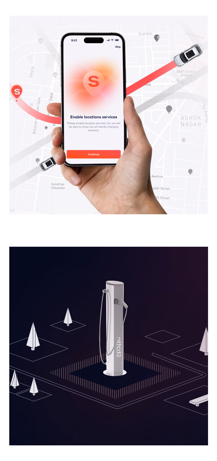
Statiq is one of India’s largest EV charging networks. As the brand scaled across cities, its website needed to do more than just inform. It had to become the first stop for drivers looking to discover, book, and trust charging stations. We partnered with Statiq to redesign their website into a platform that matched their growth and made the EV experience simpler.

Problem Definition

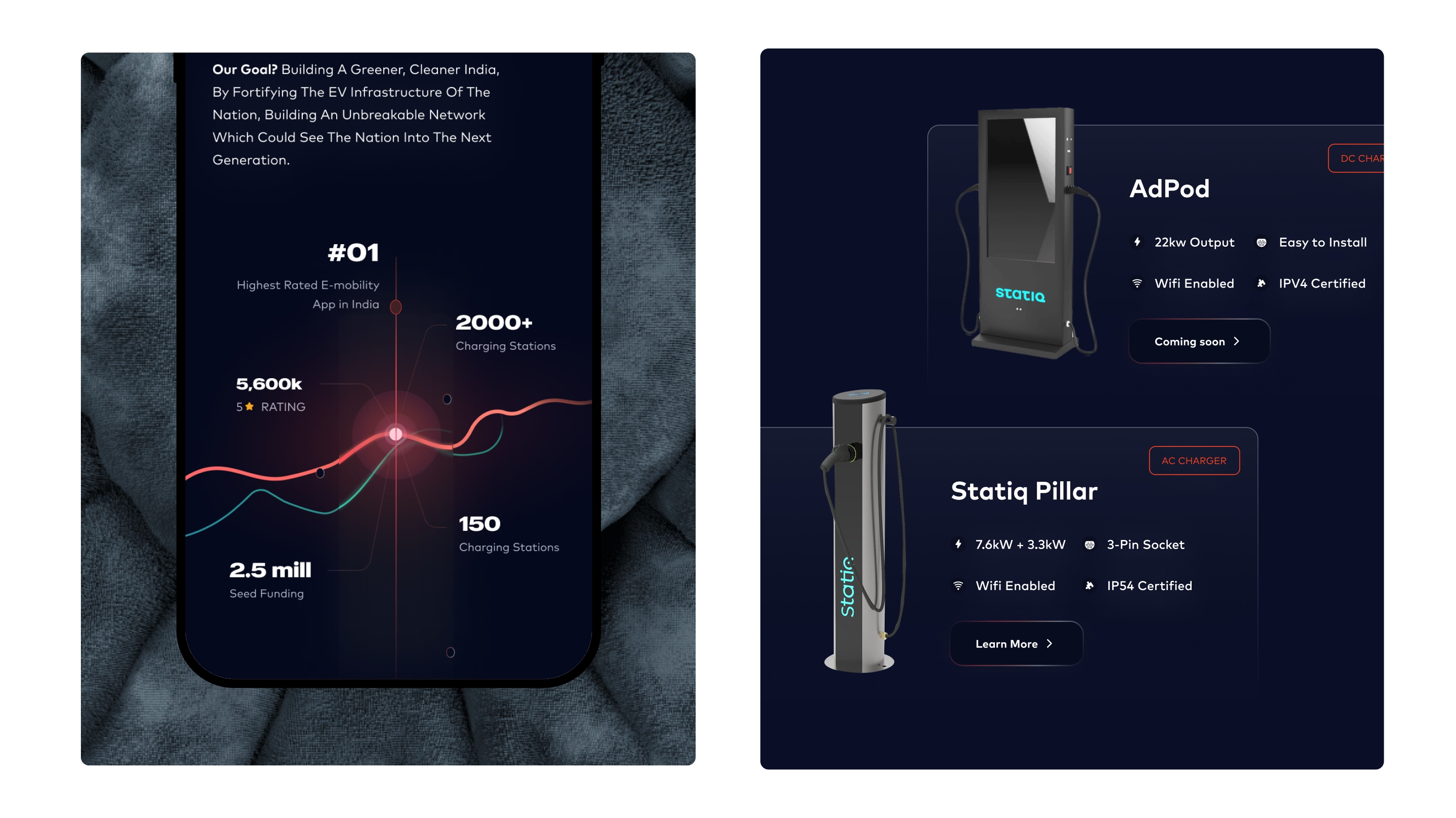
The existing website struggled to keep pace with Statiq’s growth. Drivers found it difficult to locate charging stations, booking journeys were unclear, and critical details like pricing and availability were buried. The platform needed to be faster, clearer, and easier to use.

The process we followed
- Brief Understanding
- User Research
- Information Architecture
- Wireframing
- Visual Explorations
- UI Design
- Communication Design
- Finalisation & Handover
Opportunities discovered
the EXPERIENCE we created

No items found.
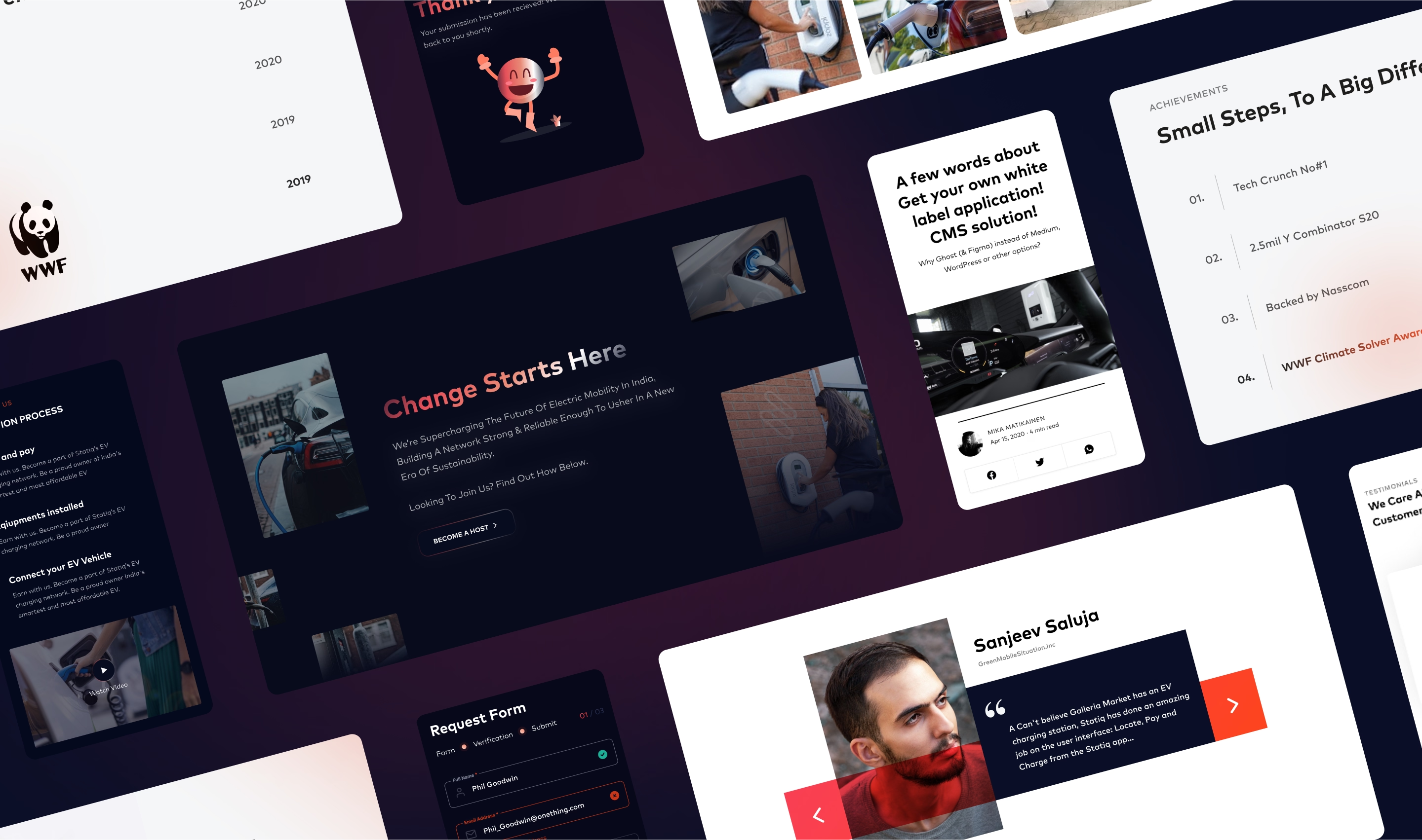

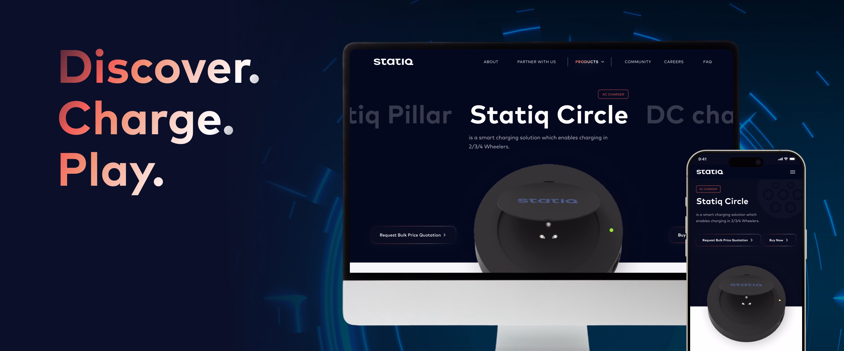
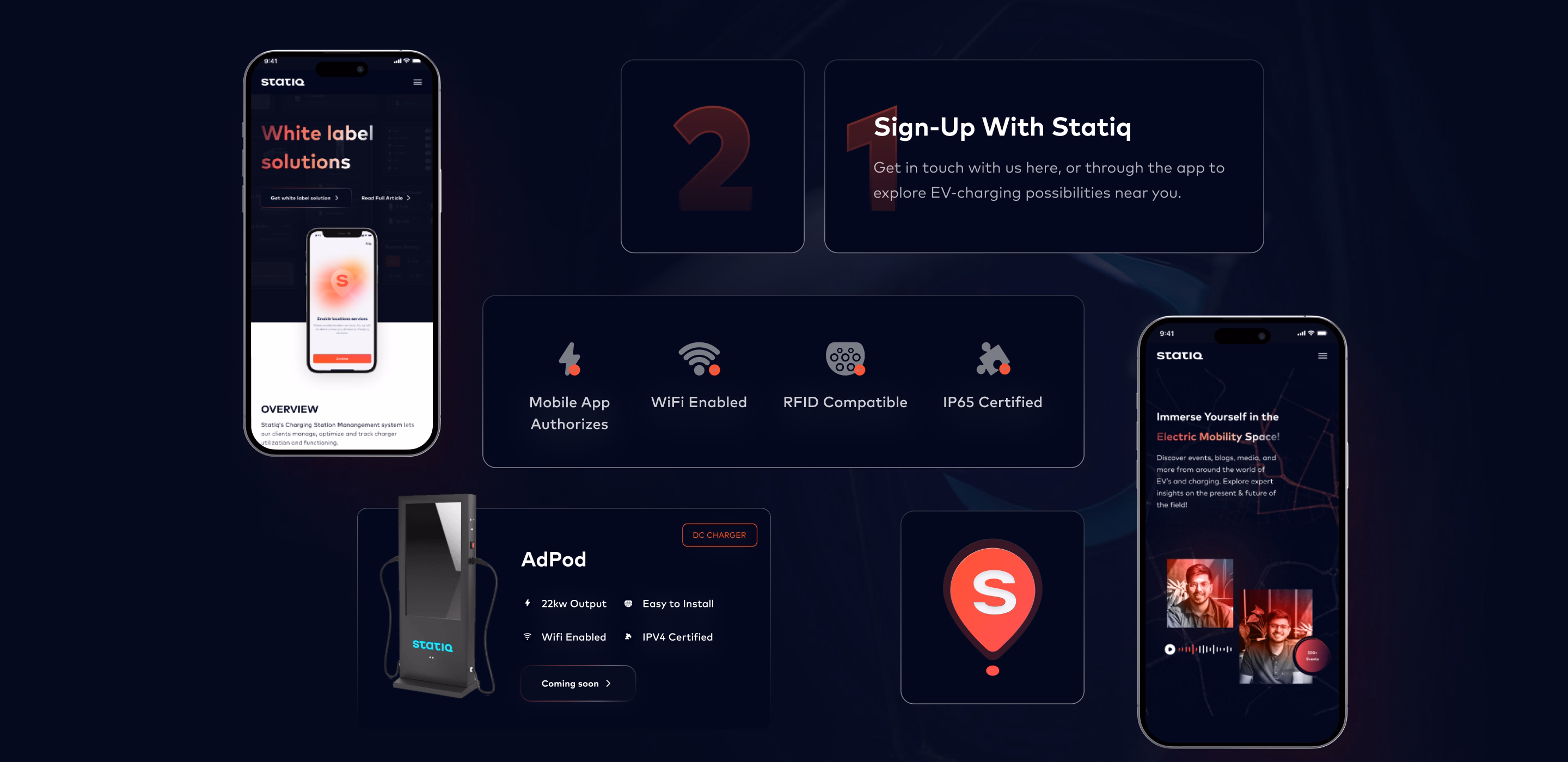
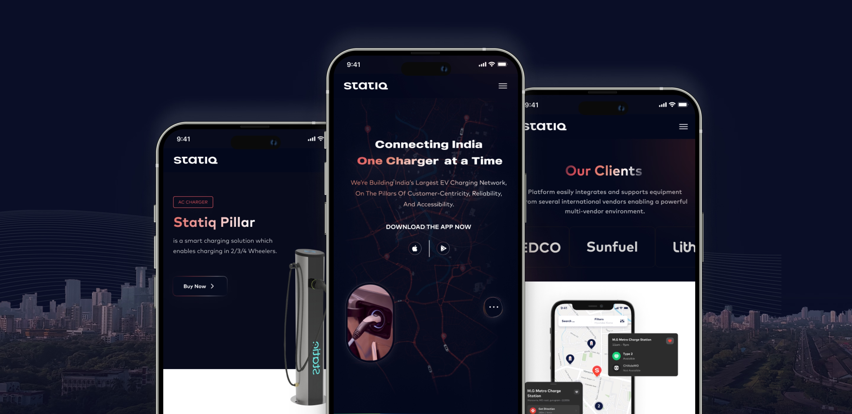
The redesigned website transformed Statiq’s digital presence into a seamless platform. Station discovery became faster, booking and payments were simpler, and transparent details built trust with drivers. A modern visual language gave the brand a consistent and credible face online, creating a website that grew with Statiq and supported EV adoption across India.
No items found.
No items found.
No items found.


No items found.
No items found.
No items found.

The IMPACT
No items found.
Our CLIENTS
ARE SAYING...
No items found.


