Project Focus
Packaging Design

Elevating Packaging Through Benefit-Led Communication and Visual Language

Project Focus
Packaging Design

The Collaboration

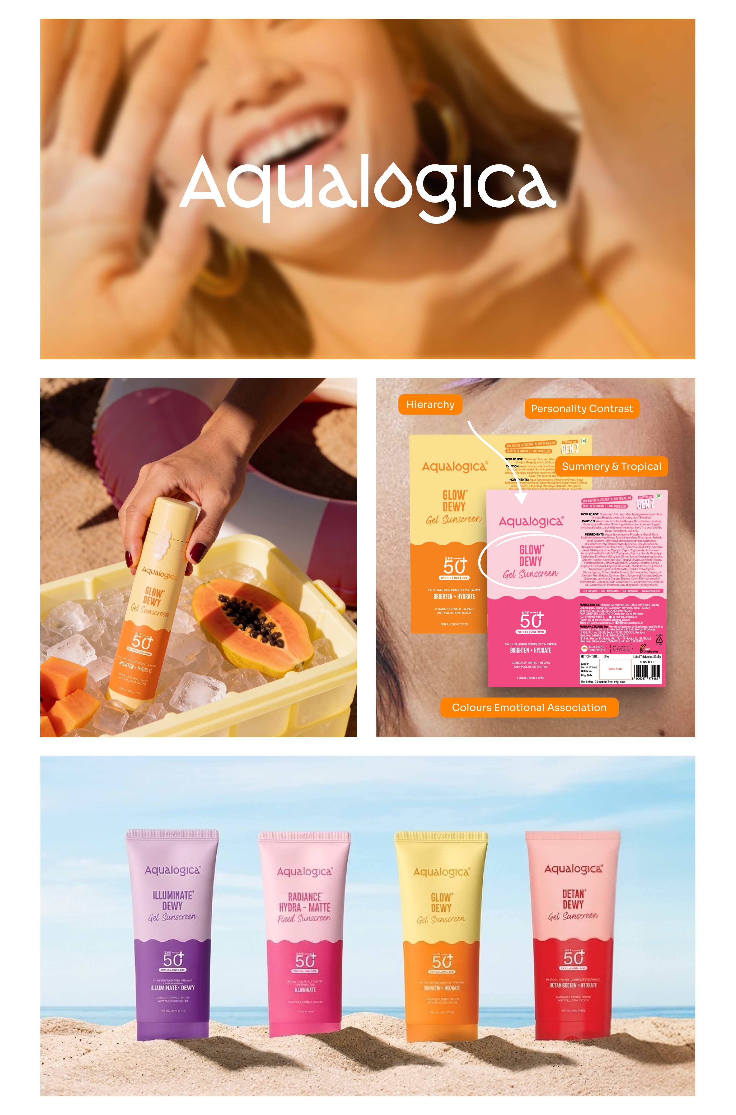
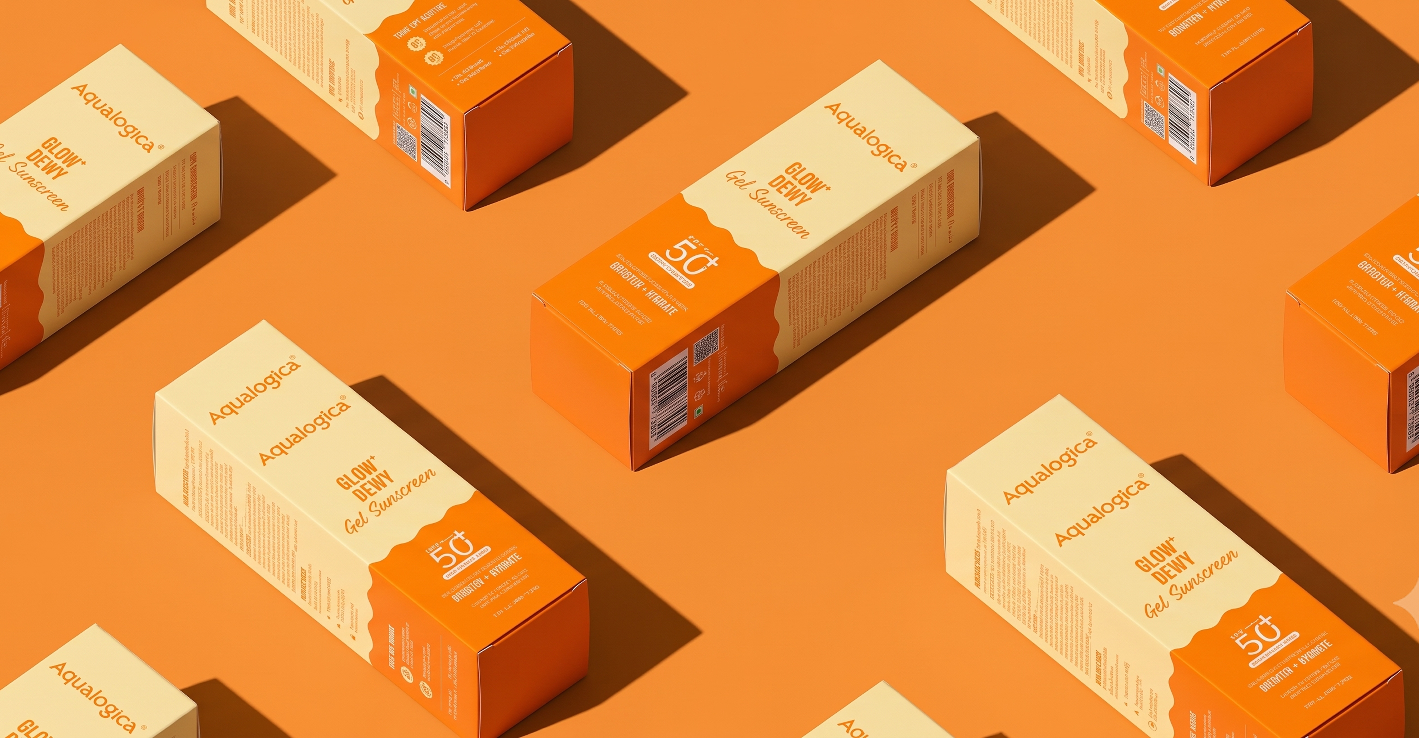
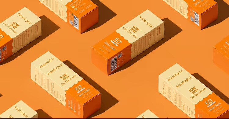
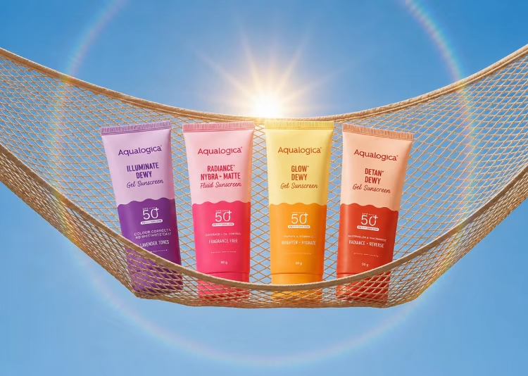
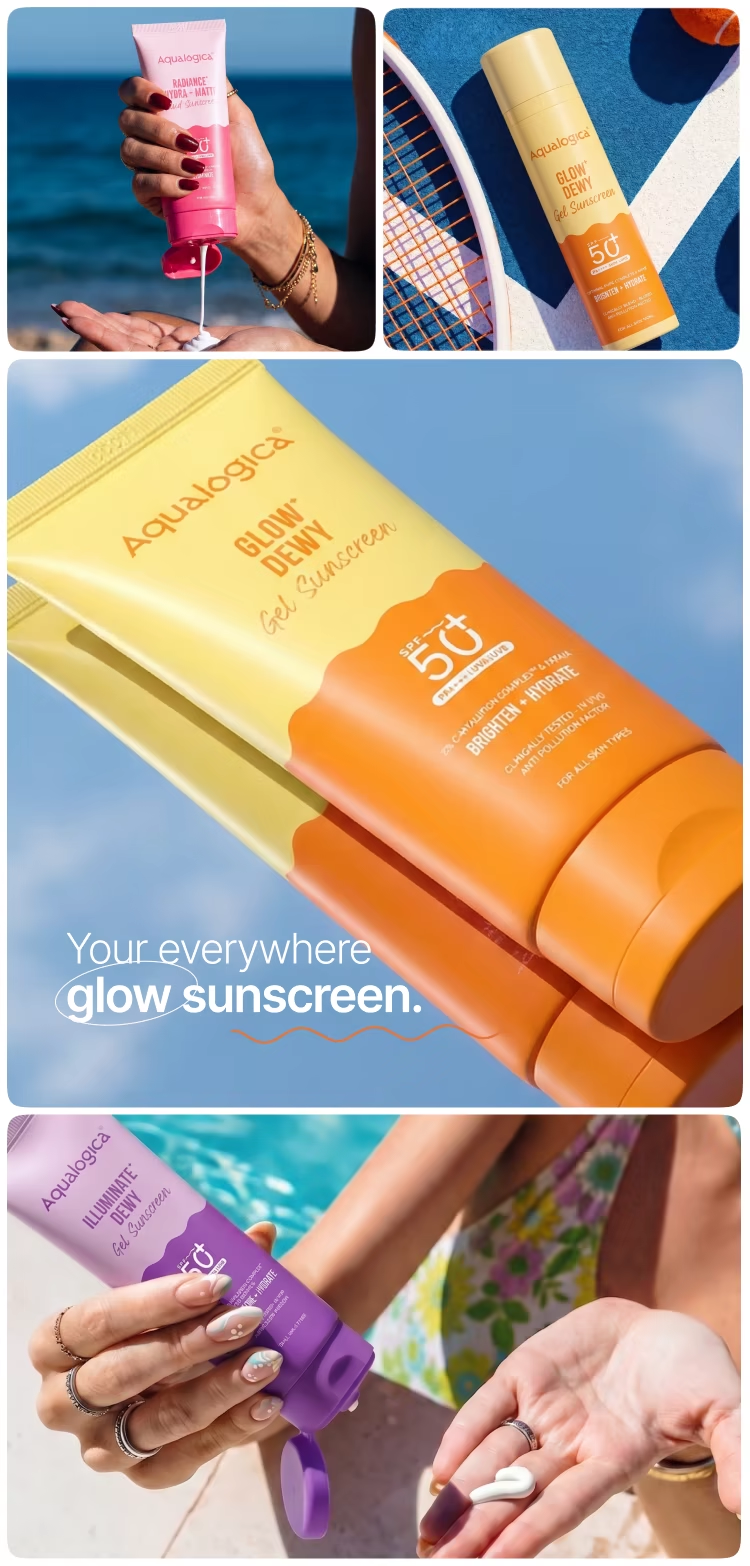
Aqualogica, a science-first skincare brand from Honasa Consumer, is known for its hydration-led formulations powered by active ingredients and fruit extracts. To strengthen its appeal among Gen Z consumers and differentiate itself in an increasingly competitive skincare market, the brand partnered with Onething Design. Our team refined the packaging system, introducing a stronger visual hierarchy, clearer communication, and a scalable identity that enhanced shelf presence while staying true to Aqualogica’s brand essence.

Industry
Consumer | UX Research
D2C
Platform
Services
Packaging Design
Award
Website/App

Problem Definition

The challenge was to create packaging that felt instantly recognisable and easy to navigate, helping Aqualogica communicate its value with greater clarity while forging a stronger connection with Gen Z consumers.

The process we followed

01
Discovery Workshop  & Research
02
Key Page  Wireframes
03
Visual Exploration
04
Secondary Page Wireframes + Watch faces
05
Visual Designs
06
Prototyping
07
Design System & Handover
  1. Discovery & Consumer Research
  2. Packaging Audit
  3. Brand Positioning Strategy
  4. Visual Language Development
  5. Packaging Redesign & Systemisation
  6. Finalisation & Handover 

Opportunities discovered

01
Benefit-First Communication

The existing packs buried key product benefits beneath competing information. Reworking the visual hierarchy created an opportunity to lead with efficacy, making product outcomes instantly recognisable while improving clarity for Gen Z consumers.

02
Hydration-Led Visual Language

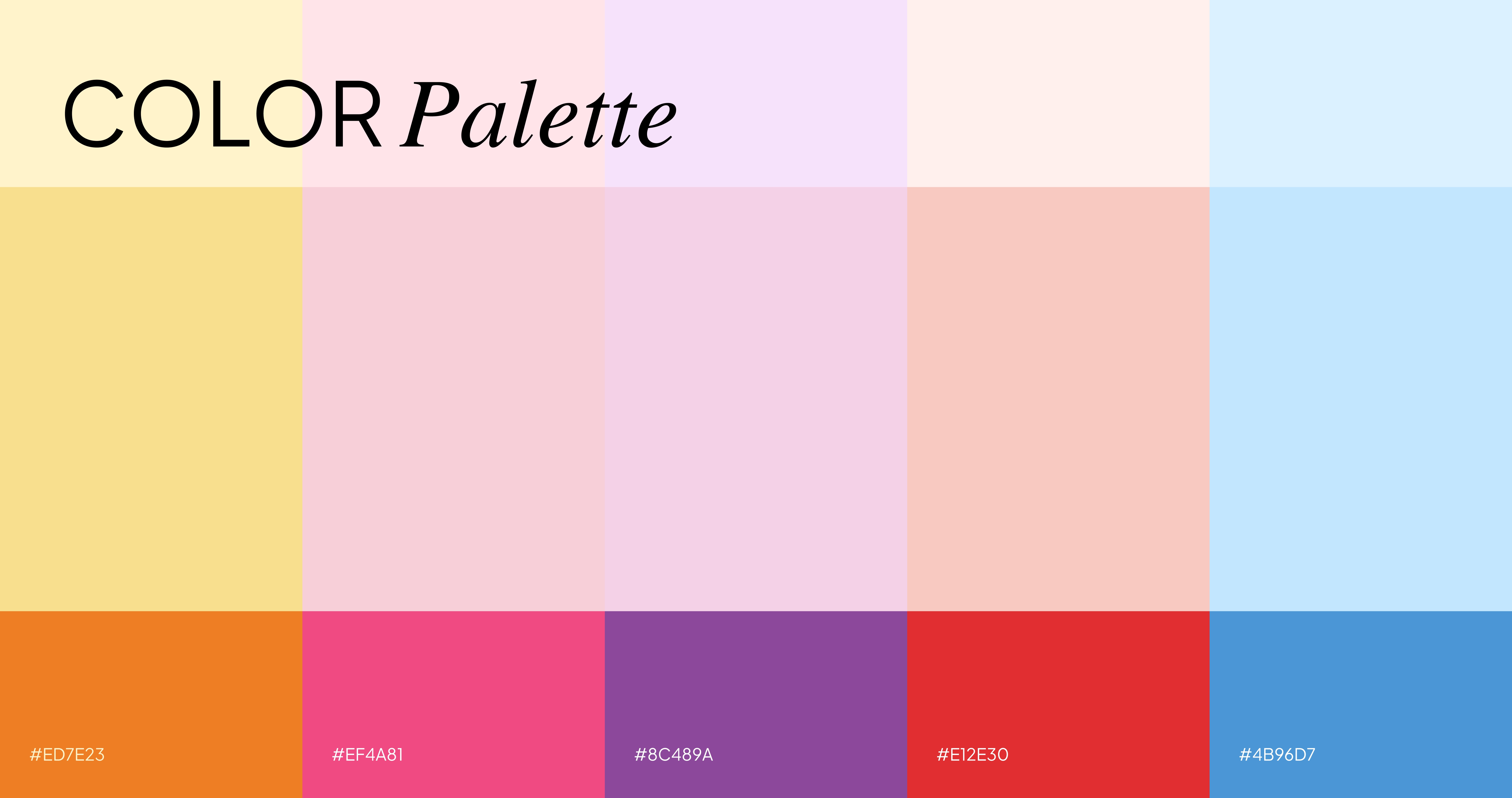
Hydration sits at the heart of Aqualogica’s formulations, yet the packaging didn’t fully express this promise. We introduced fluid wave motifs, vibrant colours and expressive typography to create a visual language that felt fresh and youthful.

03
Science-Backed Simplicity

Consumers sought clinically effective skincare without the complexity often associated with science-led brands. The opportunity lay in balancing scientific credibility with warmth by using approachable visuals and transparent communication to make efficacy feel more accessible.

04
Brand-First Pack Hierarchy

The previous information architecture diluted brand recognition and ingredient storytelling. Reorganising the pack hierarchy created a clearer path from brand to benefit, reinforcing trust and helping every pack communicate more effectively at first glance.

04
Crafting a guided learning journey

Designing a structured pathway that seamlessly guides users through their investment education journey, ensuring clarity and coherence in their learning experience.

04
Crafting a guided learning journey

Designing a structured pathway that seamlessly guides users through their investment education journey, ensuring clarity and coherence in their learning experience.

04
Crafting a guided learning journey

Designing a structured pathway that seamlessly guides users through their investment education journey, ensuring clarity and coherence in their learning experience.

04
Crafting a guided learning journey

Designing a structured pathway that seamlessly guides users through their investment education journey, ensuring clarity and coherence in their learning experience.

No items found.
No items found.
No items found.
No items found.
No items found.
No items found.

Our CLIENTS
ARE SAYING...

No items found.

Let’s Collaborate to turn your vision into reality!

Schedule a Call
Contact Us