


The Collaboration
Qubo, India's largest brand for smart home devices collaborated with us to design an app experience thats scalable and easy to manage across devices. Our work includes the design of the mobile platform for iOS and Android application, which incorporates adding, managing and operating smart Qubo devices through a simple intuitive app design.

Problem Definition

How might we help Qubo enhance its app to enable users to better manage and control their devices?
.avif)
.avif)
The process we followed
- Discovery Workshop & Research
- Secondary Research
- Information Architecture
- Wireframes
- Visual Designs
- Prototyping
- Design System
Opportunities discovered
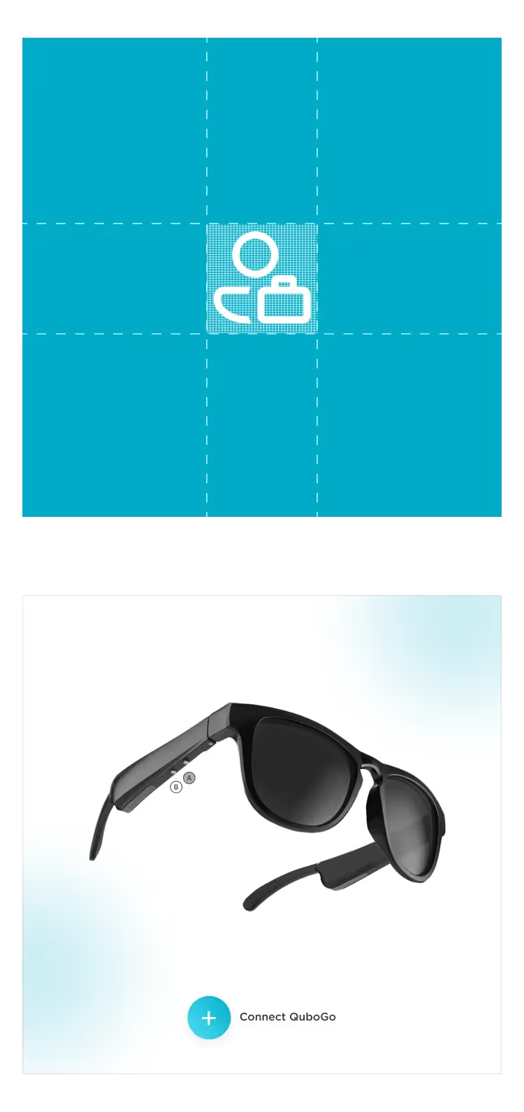
the EXPERIENCE we created
.avif)


No items found.


We crafted a visual direction, existing within Qubo's brand language, attempting to make something which is visually striking and easy to use on a day to day basis by everyone at home.
.avif)
.avif)


No items found.
No items found.
No items found.


No items found.
No items found.
No items found.

The IMPACT
No items found.
Our CLIENTS
ARE SAYING...
No items found.
.avif)
.avif)
.avif)
.avif)