Services
UX and UI Design
Client Introduction
vCard is India’s first mobile credit card underpinned by the government’s Unified Payments Interface (UPI). This integrated fintech platform displays up-to-date information about upcoming credit card dues, spending history and usage statistics within the secure infrastructure of the mobile application.
Design Challenges
01
Design a product that fosters users’ trust in all kinds of payments and financial analysis.
02
Spread awareness among users about a new and one-of-a-kind virtual credit card.
03
Position vCard as a friendly lender and a professional financial advisor.
04
Engage the user through background functionality to increase recall.
Research Insights
- Onboarding forms that were concise and had clear sections were preferred over the forms that continued over several pages and/or were heavy on illustrations.
- People above the age of 35 distrust the Credit card industry as the latter is widely perceived as a debt-trap. The invasive and persistent telemarketing of credit cards coupled with misleading or exaggerated offers has heavily stigmatized the entire industry.
- Lack of transparency in credit card cost calculations and levied interest rates was a major deterrent.

Strategize
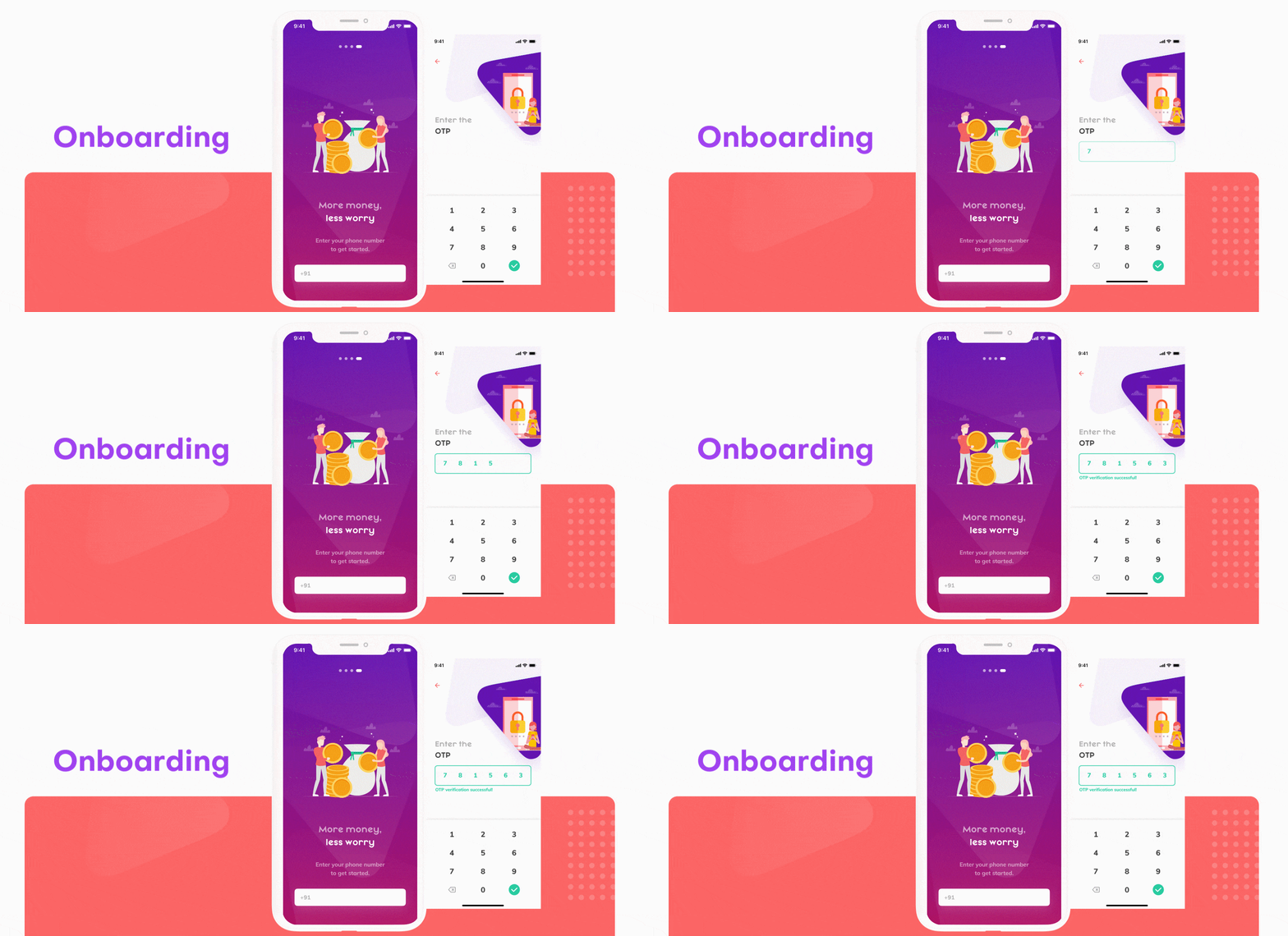
To gain the users’ trust, build confidence and stand out in the online payment industry, we worked on several iterations of vCard to simplify the onboarding process. We made it a priority to handhold the user throughout the entire application process and explain what they need to be doing in simple, jargon-free language.
We designed the flow keeping in mind that while some users are simply looking to understand and perform the next task required, others would want several reassurances and clarifications; this is why we designed a very intuitive and clear T&C page, a detailed application tracking page and several screens letting the user know what documents they would need to provide and why.
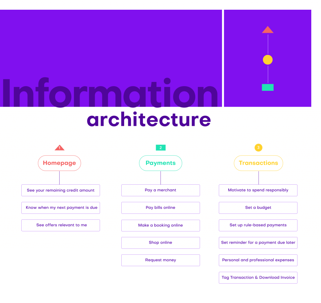
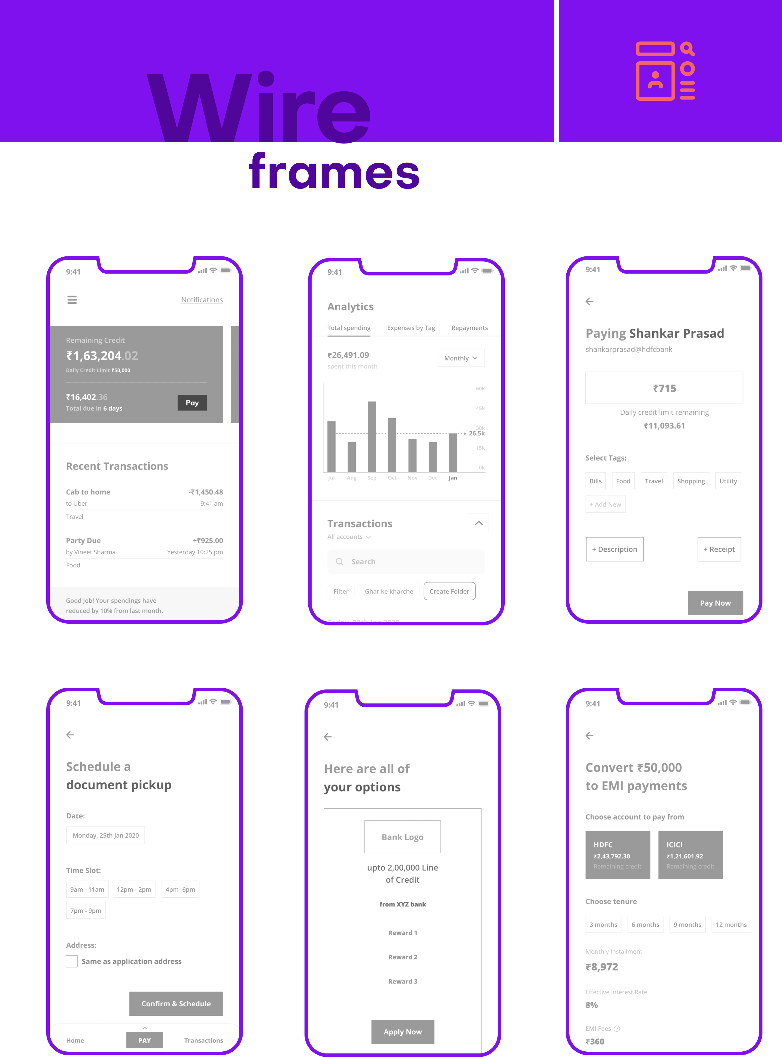
To ensure that Vcard acted as a financial advisor, we offered three major functionalities; that is, analytical, historical and future budgeting tools.These tools allowed users to visualise their spending patterns and set their budgets to manage their spendings accordingly. vCard also notifies users when it analyses expenditure trends and assesses that the individual has overshot the specified budget for the month.
The entire information is presented in an easy to consume format. We have also enriched the user’s dashboard by providing various filters; users can visualize their payment history, due amounts or the associated costs at the click of a button. Instead of simply showing a dull list of transactions, we gamified the entire module to keep users engaged by offering new and intuitive ways to understand, analyse, flag and adjust spendings through the vCard platform.
The core functionality of vCard is the ability to make payments; hence, this CTA is shown in the center of the footer and is visible and accessible to the user all times. On tapping it, the user discovers various payment options such as QR codes, UPI and netbanking.

Deliver
While designing for vCard, we picked colours in the shades of purples, peaches, and lime green to reflect a level of friendliness and intimacy that is more synonymous with social networking applications. We incorporated fun, quirky, and delightful vector illustrations to propel banking into 2020 and differentiate vCard from the plethora of boring banking apps.
For typography, we chose the main typeface -Muli to look as clean as possible, especially when displaying numbers. The heading font- Mayeka, was chosen to lend the app a distinctive and modern look while still coming across as friendly and approachable to the conservative Indian user.

 Thoughtcast
 Blogs
Blogs
