 Thoughtcast
 Blogs
Blogs

Dashboard design isn’t something that designers typically focus on. However, a dashboard that is easy to use and intuitive is sure to enhance the overall user experience, and is in fact extremely important.
What Is A Dashboard?
A dashboard is a set of graphical menus and interfaces that give the user quick access to data and information, as well as simplify any editing processes they might need for a website or an app.
The dashboard design contains information like stats, analytics, schedules, messages, and more. It is basically a user interface that is designed to interact with the back-end of a website or an app, so that a user can make changes and access their info. It can be thought of as a control panel or an admin panel and gives users access to all the necessary data they need to be able to perform all the different functions on a website or application.
A good dashboard’s UI design will have an intuitive layout that makes it easy for users to control the site or app and make useful decisions. The advantages of good dashboards are that they truly stand out, and websites or apps with these dashboards will receive praise from users and also see increased usage.
Dashboard UI design is an opportunity to think of the unlimited possibilities to present data in a creative way. They are extremely useful to organise large amounts of data, navigate it, and finally interpret it so that we can use it in useful ways.
They are becoming extremely important in this digital age, as we are being bombarded with data from everywhere. Thus the best dashboards should organise data in such a way, that users can easily understand where the information is coming from.
Dashboard Design Best Practices
1. Keep it simple: A dashboard should present information in a clear and concise manner. Avoid cluttering the dashboard with too much information or unnecessary visual elements.
2. Prioritise information: Identify the most important information and make it the most prominent. Use color, size, and position to highlight important data.
3. Consistency: Keep a consistent visual style throughout the dashboard. This includes fonts, colors, and layout.
4. Use white space: White space helps to separate different sections and makes the dashboard more visually appealing.
5. Intuitive navigation: Make it easy for users to navigate the dashboard. Use clear labels and logical grouping to make it easy for users to find what they need.
6. Responsive design: Ensure that the dashboard is optimised for all screen sizes, including mobile devices.
7. Data visualisation: Use charts, graphs, and other visualisations to help users quickly understand complex data.
8. User feedback: Collect feedback from users and use it to improve the dashboard. Regularly update the dashboard to meet user needs and expectations.
Let’s look at the top 20 dashboards that designers can take inspiration from. Let’s go:
1. Airtel IQ: Airtel is India’s leading telecommunications company, with a vision to provide a complete cloud communication suite for businesses to transform customer engagement across channels. As a result of dealing with a vast number of customers and data, we crafted an enterprise-grade solution from the ground up. Onething Design – UI UX Design Company meticulously designed a call logs dashboard which offers a comprehensive overview of all the relevant information with just a quick glance. Our main objective was to assist users in obtaining a broad understanding of the customer’s details & gathering valuable insights. The screen you can see below is the dashboard we built which allows users to seamlessly switch between customers, interactions, & concerns, without breaking logical consistency or flow.
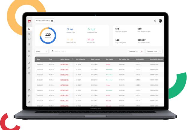
Airtel IQ Dashboard design
2. Prescinto: Prescinto has gained the trust of users in 14 countries and is currently monitoring over 12,000 MW of clean energy projects, offering a 10x return on investment. While the system was highly adaptable, the team encountered difficulties with complex user flows & restructuring the information architecture. With the help of AI, we designed Prescinto’s dashboard to enhance the efficiency of renewable energy management systems, simplify operations and maintenance, and maximize returns on energy investments..This resulted in reducing the learning curve for users & making it easier for them to navigate through the dashboard, creating room for customisation so users can gain some control.
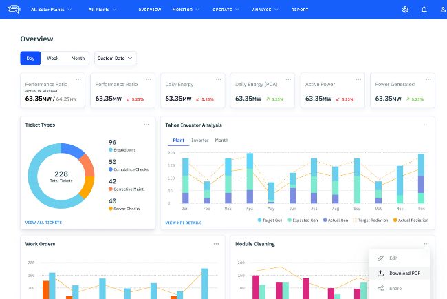
Prescinto Dashboard design
3. Google Analytics: Google Analytics has a clean and minimalistic dashboard design that focuses on displaying essential information in an easy-to-read format. It also includes interactive charts and graphs that allow users to drill down into specific information. This dashboard allows users to seamlessly switch between customers, charts, & graphs, without breaking logical consistency or flow.

Google Analytics Dashboard Design
4. HubSpot: HubSpot takes a slightly different approach with its dashboard, which features a card-based layout that makes it simple to navigate different sections of the platform. You’ll also find interactive charts and graphs that allow you to analyse your data in real time. Newly designed interactive dashboard is more engaging, easy to navigate and finds information in seconds, thus making a seamless user experience.
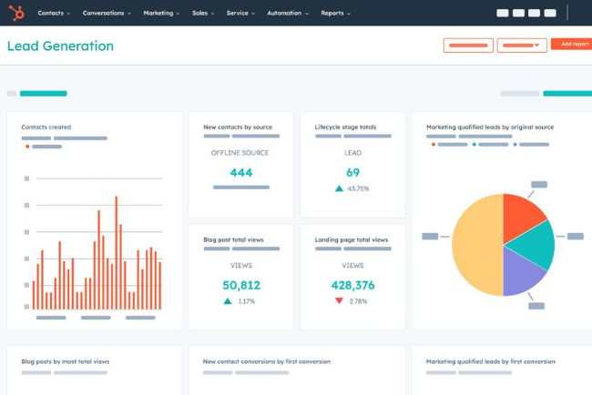
HubSpot Dashboard Design
5. Trello: Trello’s dashboard is about making it easy to stay on top of tasks and deadlines. The card-based layout lets you quickly organize and track tasks, while interactive charts and graphs help you keep an eye on progress. And with a sleek dark mode design, it’s easy to use even in low-light environments. It undeniably shows Trello’s ability to captivate its user base by simplifying the “to-do list” and endowing it with a unique character that distinguishes it from other similar platforms.
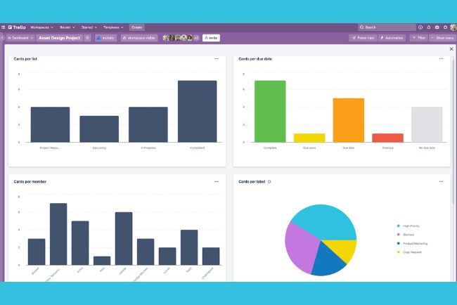
Trello Dashboard Design
What sets these dashboards apart from others is their user-centric design. Each one was crafted with the user in mind, making it easy to find the information you need and understand it at a glance. The use of interactive elements also enables users to customize the data displayed on the dashboard. For example, users can zoom in and out of charts and graphs, change the date range, or select specific data points to analyze. This level of interactivity not only enhances the user experience but also makes it easier for users to gain insights into their data.
Furthermore, user-centric dashboards prioritize the user’s needs, making it easy for them to find and understand the information they need. The use of interactive elements adds an extra layer of functionality, enabling users to analyze and customize the data presented on the dashboard.
6. TextMagic: TextMagic’s dashboard design is both sleek and intuitive, with a clear focus on ease of use. The design is clean and minimalistic, allowing users to quickly access important information without being overwhelmed by unnecessary clutter. It features interactive charts and graphs that allow for easy analysis of data, and its simple navigation makes it easy to switch between different sections of the platform.
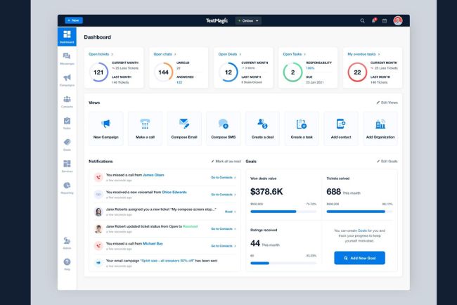
Image Credit: Dribbble
7. Enroly: Enroly is an app designed to engage students, which features a strategic dashboard that is unique within its niche. The team of designers, developers, and product owners worked tirelessly to create the screen displayed below.
8. Gridle: Gridle’s dashboard design is based on a card-based layout that makes it simple to navigate between different sections of the platform. The design is modern and visually appealing, with bold colors and sharp graphics. Its interactive charts and graphs allow for real-time data analysis, and the platform’s intuitive navigation makes it easy to use, even for first-time users.
9. Ricochet360: To enhance users’ ability and streamline their sales processes, Ricochet360 has a dashboard design that is both clean and intuitive. The dashboard comes equipped with interactive graphics that provide real-time analysis of sales data. Additionally, Ricochet360 dashboard has advanced features such as lead management tools, call tracking, and reporting, which can all be accessed from the dashboard interface.
10. Hirerise’s: Two words are enough to sum up another amazing dashboard design that are, simple and easy to use. Hirerise’s design is clean, allowing users to quickly access the information they need. It features an interactive and easy way to analyze recruitment data, and makes it simple to switch between different sections of the platform.
11. Tymewise: Tymewise dashboard assists users in managing their time more effectively. The dashboard has been designed with advanced features like time-tracking tools and productivity analytics, all of which can be accessed through the user-friendly dashboard. Thus, making an easy approach for the users to navigate and control the dashboard individually.
12. PublishXI: The primary focus of PublishXI’s dashboard design is to provide users with a straightforward and user-friendly experience. The design is modern and uncluttered, with the main goal of assisting users in efficiently managing their content. The platform offers interactive ways to help monitor content performance, along with advanced features like social media scheduling and content optimization. The navigation is intuitive, allowing users to use different sections of the platform, catering to content creators of all skill levels.
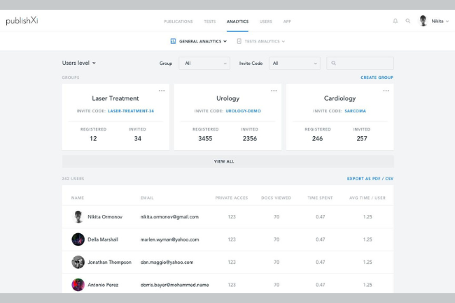
Image Credit: Dribbble
13. Haven Diagnostics: It has taken a pioneering step by leveraging the complex mathematical models that the healthcare sector uses to predict infection risks and applying them to the corporate office environment. This has resulted in highly specialized dashboards that stand apart from what we have witnessed so far. Among their dashboard offerings, one is dedicated to forecasting and presents contagion graphs with future projections, thus qualifying as an analytical dashboard.
14. VMware: VMware dashboard dashboard provides real-time visibility into performance, health, and capacity utilization. It has proactive monitoring, troubleshooting, and alerts for efficient operations. The features include better productivity, quick problem solving, optimized resource usage, and reduced downtime.
15. Tromzo: Tromzo app ensures the security of codes, & comes with a two version dashboard: First is full access, that is reserved only for the administrators, & second is limited access, that is accessible to the entire team. To simplify the process of sifting through loads of data, Furthermore, it offers a wide range of different filtering options that help users locate the specific information they need.
16. Soft UI: It is crafted as a modern user interface design that features subtle and lightweight design elements, such as shadows, gradients, and rounded corners. Including such elements has resulted in improved UX, better accessibility, and a more fresh and stylish look. Soft UI Dashboard is designed in a way that it has improved user engagement, productivity, and simplified navigation, making it a popular choice for dashboard and application design.
17. Koemei: It has created a meticulously crafted dashboard that serves the utmost clarity and presents users with two pivotal metrics: the total number of searches conducted across video content, and the number of searches that yield meaningful results. In the digital era where the internet is mugged up with an immense volume of video content, yet only a paltry 1% of it has been transcribed, which presents a considerable challenge for those seeking to search for specific information within such content. Koemei, however, offers a Software-as-a-Service (SaaS) platform that addresses this very challenge, rendering videos eminently searchable.
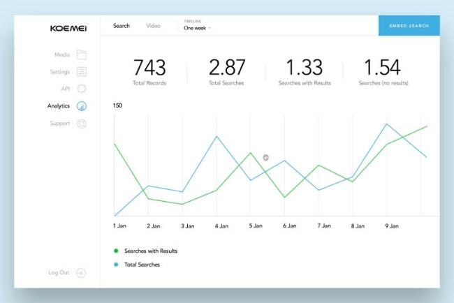
Image Credit: Dribbble
18. Asana: Asana’s dashboard is crafted to help several teams at once, it ultimately manages their projects and tasks with ease. The layouts are simple, focusing on the visual representation of tasks and deadlines. It features a calendar view that makes it easy to track due dates and an interactive graphical representation that provides insights into project progress, pending tasks, errors and obstacles.
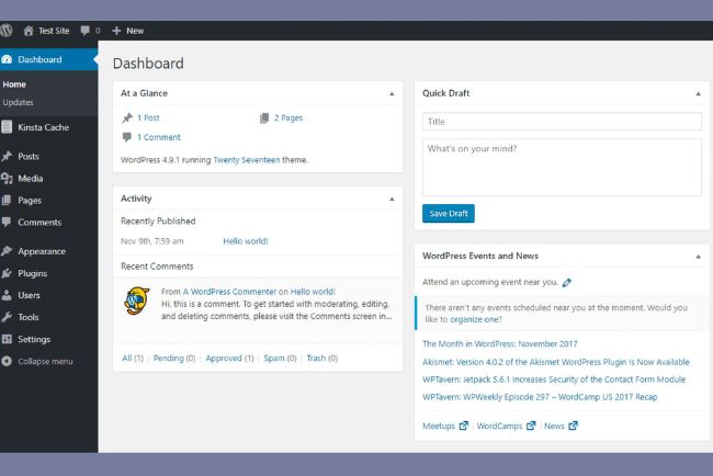
19. WordPress: The WordPress dashboard is intended to assist website owners in managing their content. The dashboard has a clean and straightforward appearance that gives information on website performance. It also provides customization possibilities, including plugins and themes, to improve website functioning. Furthermore, advanced filters are developed to make the research smooth.
20. Tableau: Tableau’s dashboard is a robust data visualization and analysis design, with adjustable layouts and interactive charts and graphs that provide users with important insights into data patterns. It also connects with various data sources and databases, making it a flexible data analysis platform.
What sets these dashboards apart from others is their user-centric design. Each one was crafted with the user in mind, making it easy to find the information you need and understand it at a glance. The use of interactive elements also enables users to customize the data displayed on the dashboard. For example, users can zoom in and out of charts and graphs, change the date range, or select specific data points to analyze. This level of interactivity not only enhances the user experience but also makes it easier for users to gain insights into their data.
Furthermore, user-centric dashboards prioritize the user’s needs, making it easy for them to find and understand the information they need. The use of interactive elements adds an extra layer of functionality, enabling users to analyze and customize the data presented on the dashboard.
Conclusion
In this evolving digital era, where data is abundant, a good dashboard design should be intuitive, organize information in a creative way, and enable users to easily understand the data. The top 5 dashboard designs we have discussed – Airtel IQ, Prescinto, Google Analytics, HubSpot, and Trello – stand out for their user-centric design and use of minimal elements, making it simple for users to navigate and customize the data required.
As a designer, you can find inspiration from these designs and create a great dashboard design UX by prioritizing the user’s needs and providing easy access to information. There is plenty of dashboard design inspiration available on the internet that can help you get started on your design journey. There are also plenty of templates available that provide everything you need to create great dashboard design UX.